News
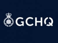
New GCHQ logo
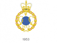
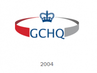
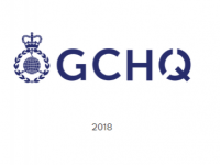
Short history of GCHQs logos
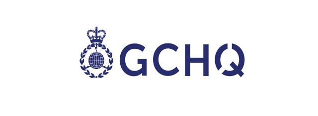
New GCHQ logo (Source: © Crown copyright)
USPA NEWS -
GCHQ´s original badge* was created in 1953 when the organisation moved to sites in Cheltenham at Oakley and Benhall. For over fifty years the blue globe, lightning bolts, and golden crown appeared on letters to Ministers and intelligence reports to partners and allies, helping to establish GCHQ as a crucial pillar of the UK´s national security.
In 2004, the organisation undertook another major move, into the now famous “˜Doughnut´. The current logo was created to mark the opening of the new building, but it also symbolised how GCHQ´s operational challenges and ways of working were adapting to the post 9/11 world. This logo has served GCHQ well for 14 years.
With GCHQ's Centenary year coming in 2019, another milestone approaches rapidly and presents another moment in their history to re-examine GCHQ´s visual identity. What they wanted was a logo that reflected their past, acknowledged the present, and to position them well for the future.
With GCHQ's Centenary year coming in 2019, another milestone approaches rapidly and presents another moment in their history to re-examine GCHQ´s visual identity. What they wanted was a logo that reflected their past, acknowledged the present, and to position them well for the future.
GCHQ asked designers to consider were how a new logo would sit alongside the logos of the National Cyber Security Centre, MI5 and SIS and how it would work for possible recruits looking at job adverts on GCHQ's Twitter feed and on mobile phones; and how it should be adaptable for websites across the UK.
GCHQ asked that as far as possible the designs reflected the spirit of the new GCHQ vision and strategy, with an acknowledgment of there values ““ ingenuity, integrity, impact and teamwork.
The original badge has been updated, refreshed and simplified so it works in a more a digital world; a modern font and colour have been chosen; and something innovative and unique has been added in the Q.
Designers took their inspiration for the Q from a variety of sources: the dials of the original Bombe at Bletchley Park, GCHQ's reputation for puzzling, analysis and problem solving, and some of the features of the GCHQ building in Benhall, bringing together GCHQ´s past, present, and future.
* GCHQ's predecessor organisation Government Code & Cypher School, most famously based at Bletchley Park, did not have a formal badge. Although creating one was discussed post-war, GC&CS was a department of the Foreign Office and just used the Foreign Office badge when required.
more information: https://www.ncsc.gov.uk
Gchq Government Communications Headquarters (government Agency) (profession) Secret Intelligence Service (organization) Mi5 National Security Agency
Liability for this article lies with the author, who also holds the copyright. Editorial content from USPA may be quoted on other websites as long as the quote comprises no more than 5% of the entire text, is marked as such and the source is named (via hyperlink).

